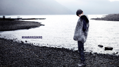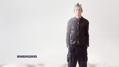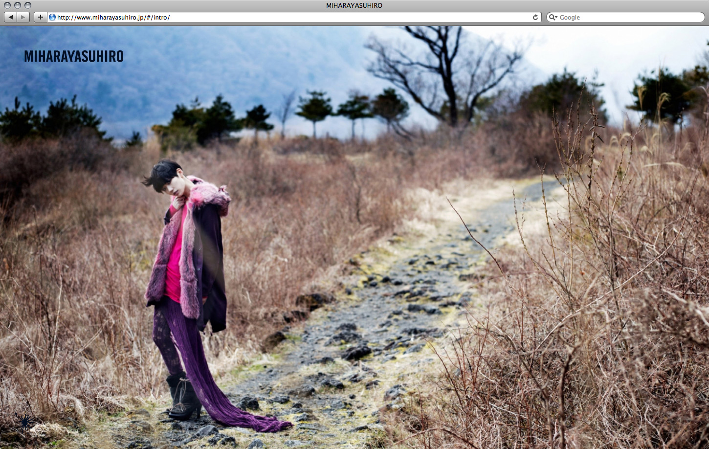
Mihara Yasuhiro Website
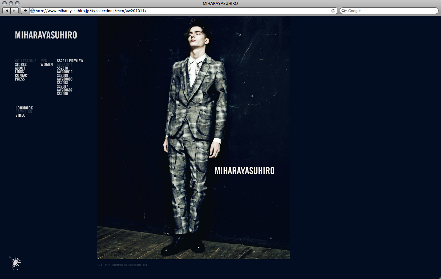
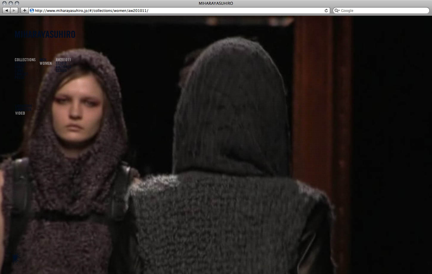
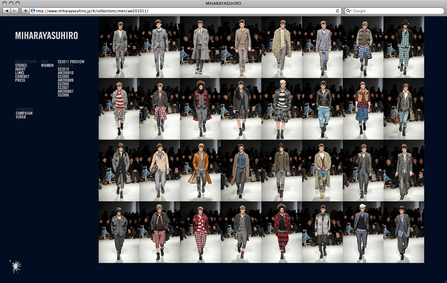
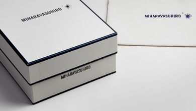
Following the just recent relaunch of the logotype, Yasuhiro commissioned Chewing The Sun to design and programme his website and a new line of tags and hang tags, introduced with this season’s collection…
Based on a simple analogy, the design quickly evolved into an overall and user-friendly guidance concept: A bichromatic colour-theme – like in kid’s fashion separated by gender – dyes the women’s tags in a restraint warm grey while dipping the men’s in a mandatory pale royal blue, and thus blending aesthetic uniqueness with a high standard functionality…