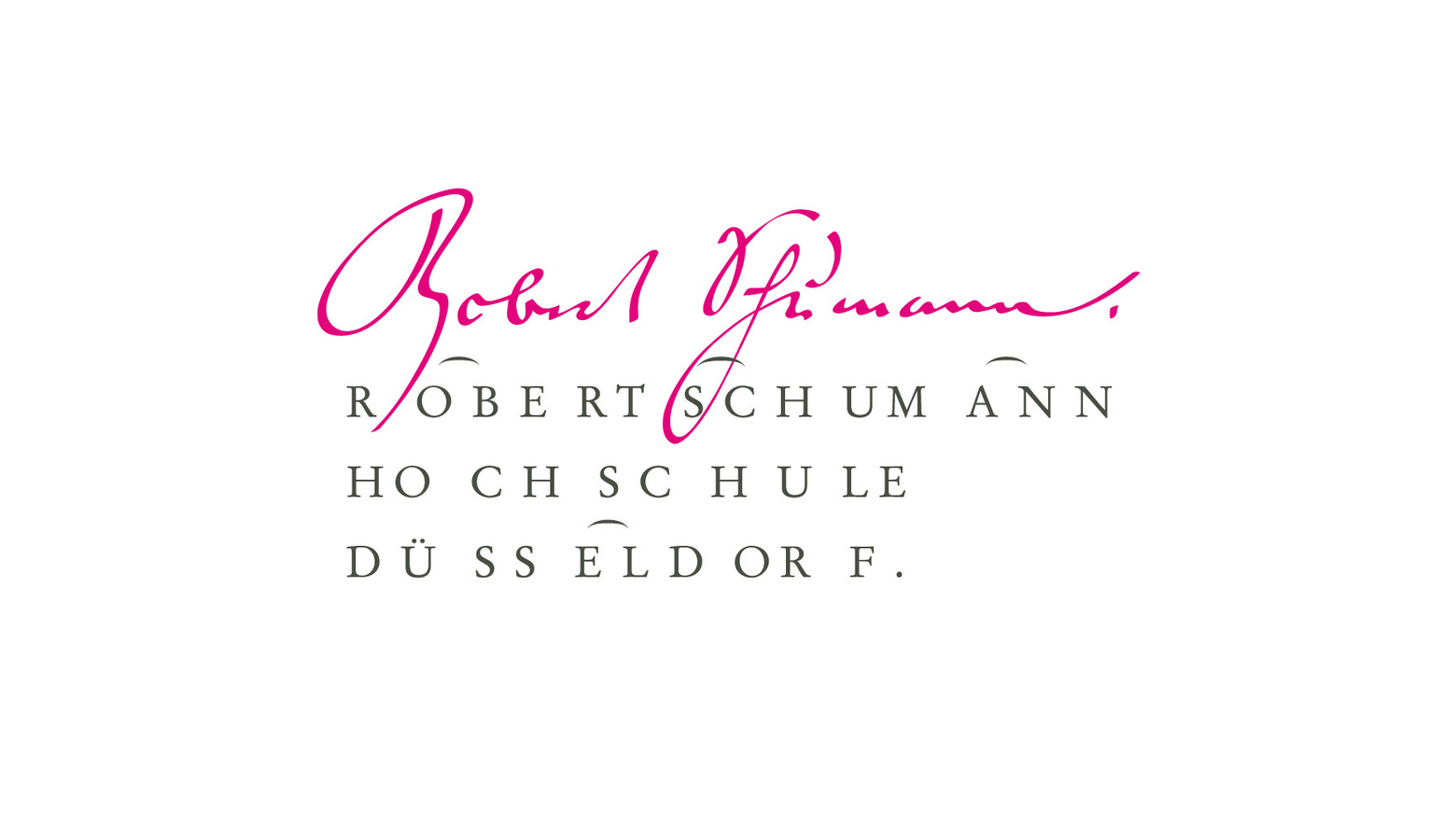
Robert Schumann Hochschule Logotype (red dot Award 2009)
Roughly a thousand students at Robert Schumann Hochschule involve themselves with sounds, melodies, rhythm, timbres and sonic events in an array of ways. From training as orchestra musicians to the exploration and creation of new connections between music and media, this teaching institution with a classical background is also a place for future listening.
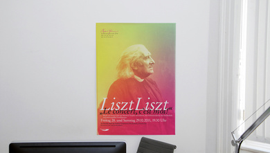
Three elements are combined in our design to create the overall look, aiming to communicate all the facets of this institute with his international reputation.
Stempel Garamond was chosen as a classic typeface that exudes confident elegance yet still manages to point towards tradition and quality in education. However, that tradition interacts with the present at first glance: The logo’s textual component is set to the rhythm of Schumann’s 3rd symphony in E flat major op. 97 („Rheinische“), it instantly links language to music.
As the third design element, the eponym’s signature conveys a very personal, exclusive moment of musical creation.
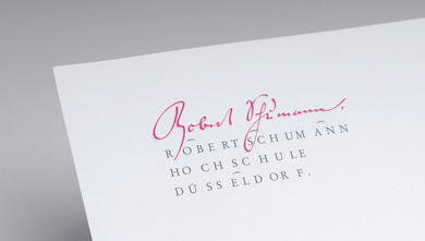
This combination creates a clear external presentation for the university that can employed for all departments and events.